The Main Dashboard
 5: Navigation - Main Dashboard
 6: The Main Dashboard
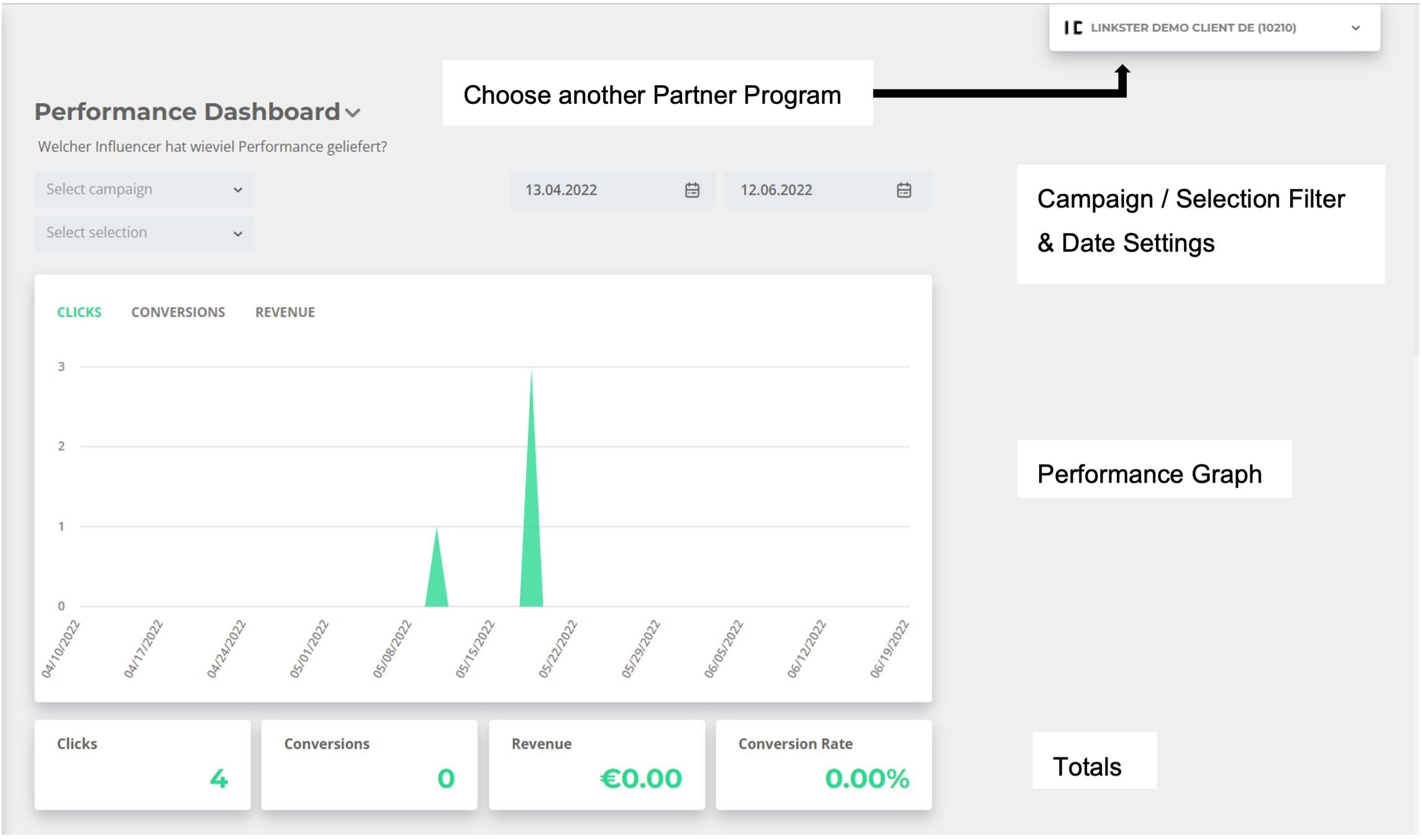
The performance dashboard is the first thing you will see when logging on to the Linkster App. The numbers you see are specific for one partner program. You can switch to another partner program by clicking on the box in the upper right corner.
On this page, you can see all relevant data from your campaigns and influencers at one glance. The numbers are collected in real-time, and the date range will dynamically adapt to display the last 60 days. The totals below the graph display the most relevant KPIs, called "Totals", and they can be individualized with the help of your Linkster contact person.
 7: Main Dashboard - Filter Selection
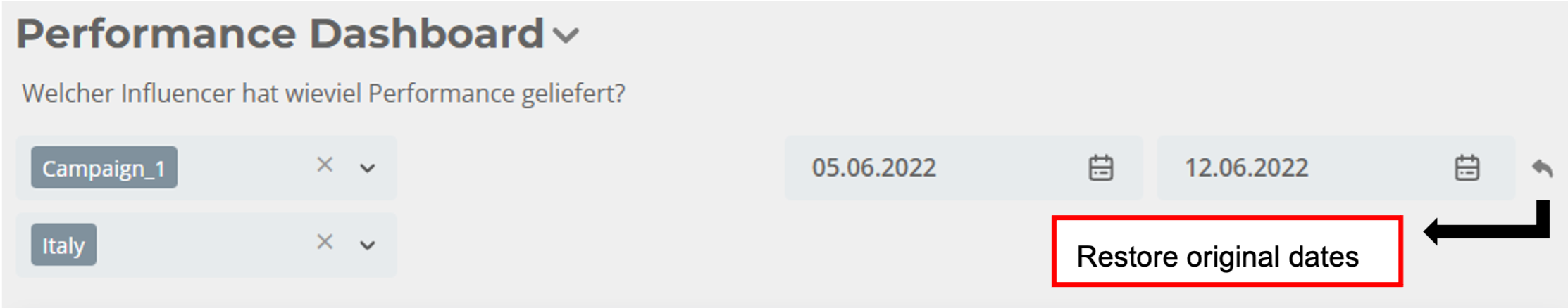
The numbers are accumulated for all campaigns and influencers, but you can filter for specific campaigns and influencer selections with the campaign and selection filters. You can also change the view to a specific date range. By clicking on the small arrow next to the calendar, the original date range will be restored.
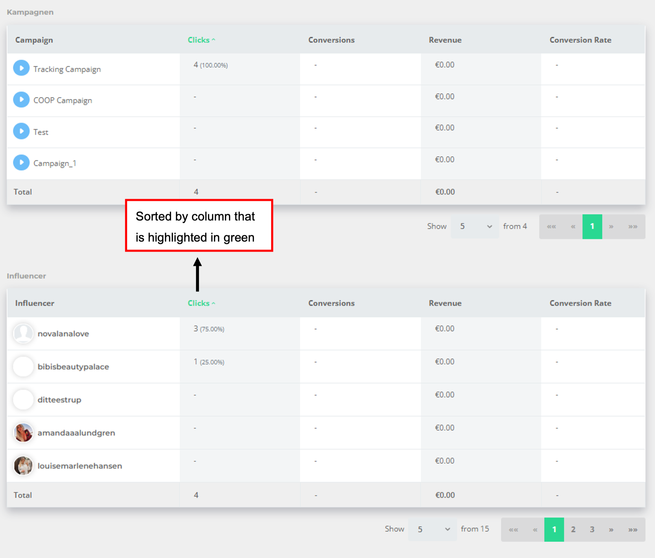
You will find two more tables on the dashboard which break down the numbers in the Total into your campaigns and the influencers' performances.
 8: Main Dashboard - Campaign & Influencer Overview
The tables are always sorted by the KPI that is highlighted in green - by default tables are sorted by click. You can click on any other column to sort the data accordingly. This applies for everything in the Linkster App.